10 Secrets to Create an Intuitive Website Design and Attract Customers
Intuitive website design is customer-centric. In simple terms, it is a design that appeals to the user and makes it very easy for them to find what they need.
Imagine that you are browsing a website. What are the things that keep you around? What attracts you the most? These are the things you need to keep in mind while working on a design. It’s kind of like reverse engineering, but could be very complicated if not understood well.
Thus, we have created the ‘All You Need to Know’ list of things to achieve a design that’s a customer magnet, and also keeps your audience engaged.
Here, you will learn exactly how you can implement these tips, too. And at the end, you will acquire a mindset that will allow you to use these hacks in your own creative ways, plus a bonus tip at the end!
You can use these tips directly in the design of your website.
Let’s discuss one parameter at a time.
Visuals:
Images: Replace as many of your paragraphs with visual representations as you can.
People usually just take a glance over web pages and click on the parts that resemble the most what they’re looking for.
- Steve Krug
A great way to do this is to accompany attractive visuals with clickable links.
The screenshot below from GrabOn’s website showcases coupon deals collection in categories with high-res thumbnails and a slider effect, which makes the design highly easy to navigate through.
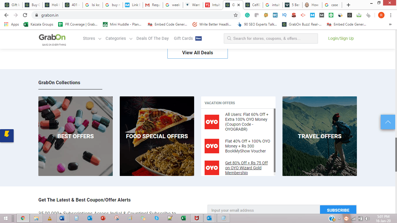
GrabOn creates a great feel of user-friendliness and intuitiveness with its design. It has a concise and well-organized layout, so customers can hop on to the deal they’re interested in with minimum hassle.
Icons: Change your text to icons. Representation with icons not only makes the text visually appealing but also effectively delivers your message. Google, a huge player with icons, believes in its intuitiveness with a representation of an action, a status, or an app.
Clear CTA: The Call to Action is an important part of the website; thus, it should be given that importance while creating the design. Place the call to action very clearly and easily to use during checkouts, forms, or purchases.
A few things that you should keep in mind?
Have the CTA and the details all at one place
Use color to highlight the CTA
Creatively situate the CTA that encourages the user to click on it
Language: Keep it to the point. For example, keep your paragraphs short and sentences shorter. Use words that tell the viewers directly what they need to know.
Open links in new tabs: Although not clearly related to the design itself, it is an important one on this list.
When external links open up in new windows, the user experience remains unhampered, translating to better performance of content and customer retention rate.
Filters: Product filters allow the user to look for exactly what they need and reduce ambiguity or trial & error during online browsing.
Customize filters as per your needs and use them creatively to match your business goals.
E-commerce store Boat and RV Accessories provided filtering by attributes on its website as part of the design revamp process, and their sales grew by nearly 200% and a 244% increase in organic search traffic.
_____________________________________________________________________________________
Pro Tip: Create a curiosity-based atmosphere on your website and address it gradually through the visitor journey. A few direct goals to set with your design project should be:
Increased session time
Trust build-up
Revisiting viewers
_____________________________________________________________________________________
Categorization: Use the power of the navigation bar.
Your navigation should beGrouped Categorically
Self-explanatory
Fully expressive of your platform’s potential
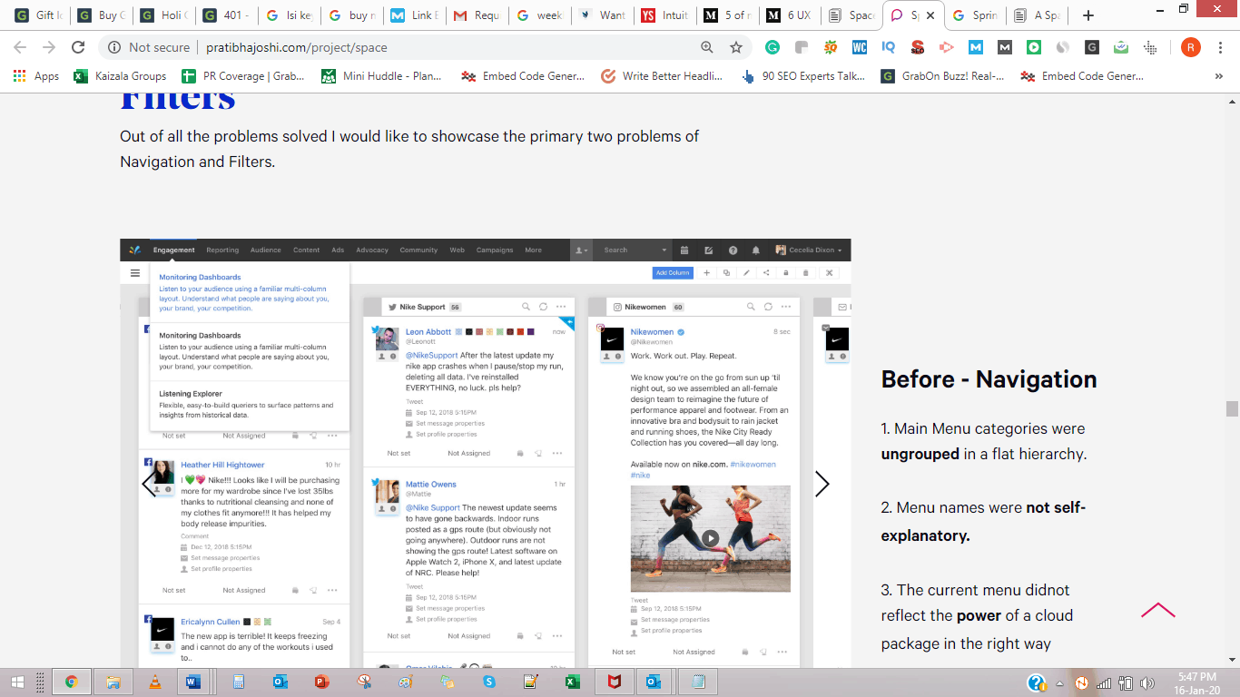
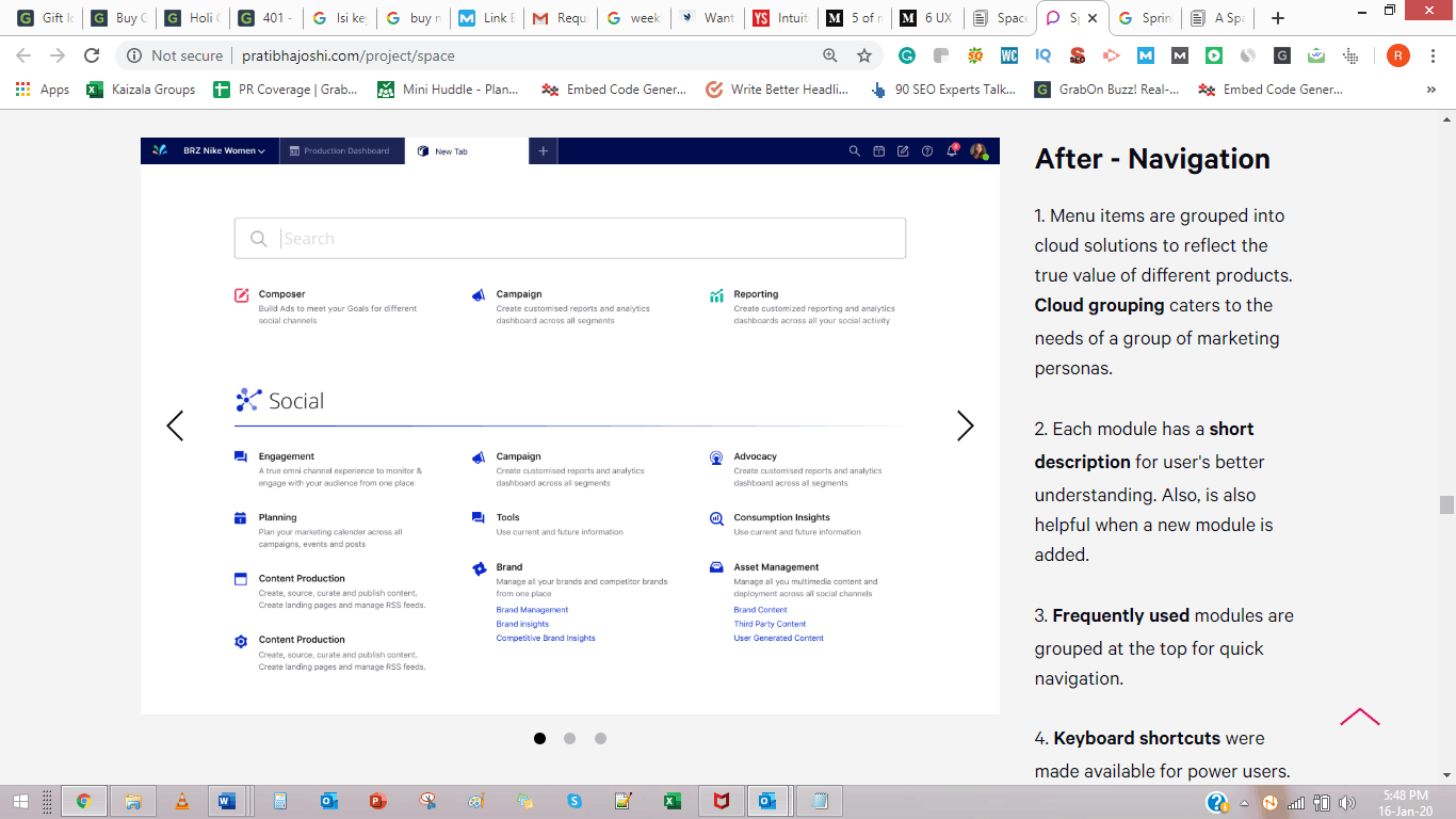
Sprinklr changed its ungrouped and confusing navigation, among other updates, and launched the new platform in 2017. The following were the notable achievements
41% fewer support tickets raised
32% reduction in training costs
Client acquisitions
Take a look at the screenshots below.
Confusing and redundant old navigation:
Grouped & intuitive revamped navigation system:
Buttons: Scrolling down a page, and there you feel like reading more. That’s where you keep a button.
Buttons allow visitors to have control over what they want to see and when.
If the content you’ve planned is too long, separate it into pages, and apply the same rule everywhere.
Create microsites: Sometimes, you have a lot to display. Segregating your content into micro sites will help pass on the message with ease and to distinct groups.
Interactivity: Opt in for interactivity where you can. Everybody loves a quick quiz time.
However, it is essential to know why you are making the quiz. What is the objective behind it? Is it to educate the quiz taker? Is it just to add some fun element? Design the quiz to answer the user’s potential questions.
Keep it simple. Here is how you can do it.
Provide choices for the answer.
Ask the questions in a simple and clear language.
Have easy-to-guess answers to the questions, which justify something that your website says.
Conclude the quiz with an important pointer.
Now that you have created a momentum of knowledge and have made the viewer feel empowered, it’s time to place a Cal to action, immediately.
Analyze: It’s always important to analyze what you have done. Keep updating your website from the conversion/other important analytics that you observe. Use awesome tools for website analytics like Google Analytics as part of your strategy to create a stunning web experience for your visitors and improve your brand value.
Bonus Tip:
Let everything direct the reader to your main message: Cut down the words in your content to only that which direct people to an action. Follow the same strategy with the graphics. Use this technique to maximize your conversions from the website.
Now that we’ve seen what you can do, let’s see where you need to begin.
This will get you started with the whole process.
You need an intuitive design to retain users. It’s as simple as that!
According to an Econsultancy’s Digital Trends report, top-performing companies are 50% more likely than their competitors to have a well-designed customer journey and provide a seamless experience.
While designing your website or any other internet platform, ask yourself the following questions.
What's the amount needed to make a purchase on your website?
How many scrolls do they need to get to a certain point?
Is filling out the contact form one of the simplest tasks they might do that day?
Think like the customer
To answer the above questions, try out this 3-step fun activity.
Browse your company's website like it’s your first time.
Closely observe how you react to that experience.
Note down all the questions that you can think of while you browse. The longer the list, the better it is.
Draft out a creative plan to achieve solutions for each of these questions.
Design is a spontaneous phenomenon and requires staying updated as per the likes and preferences of your audience. Once you notice that your visitors react very positively to the web experience, it may be time you focus on other factors like SEO, Social Media, and lead generation strategies for your business.
Related Articles
How to Get Comments on Product Hunt: 5 Proven Launch Strategies
Most makers obsess over Product Hunt upvotes, but comments are what actually drive the ranking algorithm. Learn how to craft the perfect maker story, run feedback-first outreach, and dominate the first 4 hours of your launch.
How to Improve Your Launch Conversion Rate Step-by-Step
Struggling to turn product launch traffic into actual sales? Discover a practical, step-by-step framework to fix your messaging, remove friction, and drastically improve your conversion rates.
How to Collect User Feedback Before Launch: A Beginner's Plan
Stop guessing what your users want. Learn how to systematically collect pre-launch feedback using smoke tests, problem interviews, and lo-fi prototypes before writing a single line of code.